There are various packages available for implementing autocomplete in angular and we are going to use the simplest one (ng-select).
Let’s finish talking and need to start write code. Let’s install ng-select package from command line
npm install --save @ng-select/ng-select
Now we need to Import NgSelectModule in app.module.ts. We also need to import ReactiveFormsModule so that we can implement reactive form.
import { NgSelectModule } from "@ng-select/ng-select";
import { ReactiveFormsModule } from "@angular/forms";

imports: [BrowserModule, AppRoutingModule, NgSelectModule, ReactiveFormsModule];
Now we need to define some kind of styling option to our autocomplete input. Open style.scss file and add one of these line there.
@import "~@ng-select/ng-select/themes/default.theme.css";
// ... or
@import "~@ng-select/ng-select/themes/material.theme.css";
If the import statement given above is causing error, then try to replace it with the code below.
@import "../node_modules/@ng-select/ng-select/themes/material.theme.css";
We need a component where we can implement the autocomplete box, so create a new component (autocomplete-demo) with the command below
ng g c components/autocomplete-demo
Open your app.component.html file and replace the content with this one
<app-autocomplete-demo></app-autocomplete-demo>
Now open the components/autocomplete-demo.component.ts file and add the following content.
import { Component, OnInit } from '@angular/core';
import { FormBuilder, FormGroup } from '@angular/forms';


export class AutocompleteDemoComponent implements OnInit {
   fruits= [
    {id:1,name:'apple🍏'},
    {id:2,name:'avacado🥑'},
    {id:3,name:'banana🍌'},
    {id:4,name:'blue berry🫐'},
    {id:5,name:'pineapple🍍'},
    {id:6,name:'peach🍑'},
    {id:7,name:'pomegranate'}
   ]
 isSubmitted=false;

 onPost= ()=>this.isSubmitted=true;

  frm!:FormGroup;
   ngOnInit(): void {
    this.frm = this.fb.group({
       'selectedFruit':[],
       'description':['']
    })
  }

  constructor(private fb:FormBuilder) {

  }
Implementing ng-select is very easy, we just need to add the line below and we are done.
<ng-select class="w-20" formControlName="selectedFruit">
  <ng-option *ngFor="let fruit of fruits" [value]="fruit.id"
    >{{fruit.name}}</ng-option
  >
</ng-select>
Lets implement it with some more form fiels. Open the components/autocomplete-demo.component.html file and replace its content with this one.
<div class="auto-container">
  <span class="heading">ng-select autocomplete demo</span>

  <form [formGroup]="frm" (ngSubmit)="onPost()">
    <label class="label">Fruit</label>
    <ng-select class="w-20" formControlName="selectedFruit">
      <ng-option *ngFor="let fruit of fruits" [value]="fruit.id"
        >{{fruit.name}}</ng-option
      >
    </ng-select>

    <label class="label">Descripton</label>
    <textarea class="input w-20" formControlName="description"> </textarea>

    <button class="btn" type="submit">Save</button>
  </form>
  <div *ngIf="isSubmitted" class="message">{{frm.value | json}}</div>
</div>
We need to implement some basic styling to this component. So open the components/autocomplete-demo.component.scss file and add these styles
.auto-container {
  width: 40%;
  margin: auto;
  padding: 15px;
  min-height: 300px;
  border: 1px solid black;
  background-color: rgb(244, 244, 244);
  display: table;
  font-family: "Gill Sans", "Gill Sans MT", Calibri, "Trebuchet MS", sans-serif;
}

.heading {
  font-weight: bold;
  font-size: 30px;
  color: #1c1c1c;
  display: block;
}

.input {
  padding: 5px 8px;
  font-size: 16px;
  border: 1px solid #c4c4c4;
  border-radius: 5px;
}

.label {
  font-size: 20px;
  display: block;
  margin: 8px 0px;
}

.btn {
  display: block;
  padding: 10px 15px;
  font-size: 18px;
  border: none;
  background-color: #5c00b2;
  cursor: pointer;
  color: white;
  margin: 8px 0px;
  border-radius: 5px;
}

.message {
  margin: 5px 0px;
}
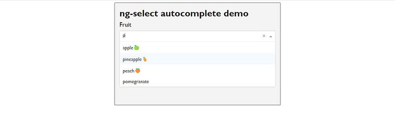
Now we can run the project, and you will see the result below
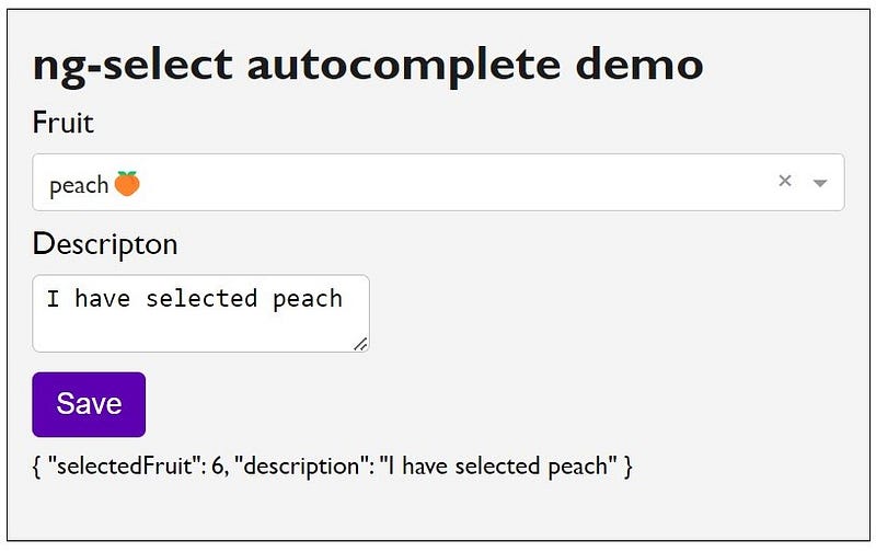
That was all about autocomplete in angular. Source code is available on GitHub repo you can check out if you need.
📎Source code: https://github.com/rd003/angular-23
Canonical link{.p-canonical}
